Evolution in Design: Unveiling Our New Logo and Why We Love It
With this rebrand, we aim to redefine our brand message and connect with our audiences in a more meaningful way. Sparkle and Shine’s purpose is to create a name in the cleaning industry for its excellent services and customer satisfaction. It aims to provide people with a smooth experience. The brand values its customers before anything else and delivers on its promise of good customer service. It’s what we were looking to highlight with our old logo design which was a minimalist wordmark.
Now, the company is experiencing a shift and unveiling its new brand symbol that shows the transformation. Let’s talk about it in detail and tell you why we love it!

Evolution in Design: New Logo
There is no right time for change. It can be anytime! We decided that it was time to evolve and showcase that in design elements too. You will find that our new logo is a bit different from the old one in quite a few ways. Let’s take a look.
Clarity
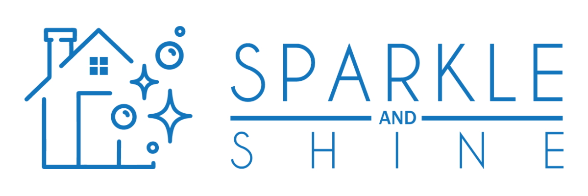
One of the first changes that you may see in the redesign is the icon that features the company name. The house merged with bubbles instantly tells the audience what the company does and clarifies its niche from the first look. This clarity in design is a huge reason why we love our new logo! It’s quite a significant change from the first one which may have been confusing for some people.

Old Logo
If you take a look at the old brand symbol, you will only find the name of our cleaning company. While it’s obvious, it did make it a bit challenging to stand out from our competitors and connect with potential clients.

New Logo
The addition of the house icon with the cleaning bubbles cannot be missed anywhere. Combined with the wordmark, this logo highlights the expertise of the company and makes it easier for clients to differentiate it from others in the industry. If you are looking to make a change as well, you can consider getting a professional cleaning logo to revamp your brand too.
Colour
In design, the psychology of colour and its meanings are very important. Blue, for instance, is commonly used in the cleaning industry as it’s associated with trust, security, and calmness. In our old logo, we used a light monochromatic hue of blue for the wordmark. As we unveil the redesign, you will see that the colour is slightly different.
Old Colours
The previous design had a lighter tone and could remind you of the colour of the water. Now, we used this colour to make a strong impact on our audience but it was time for something different. You will find that it’s a colour that is found in many cleaning logos. Take a look at the colour palettes that inspired the colours for both the brand symbols.


New Colours
We decided to go with a darker hue of blue and love it! This shift has come with the evolution in design as brands are moving towards sleeker and more authoritative logos across all industries. It also shows the growth of our company. This shade of blue is also less common in our niche and can make it easier for our loyal clients to identify our services instantly.
Typography
Now, it’s probably what will get your attention before anything else. While we decided to stay with clear-cut and modern Sans Serif fonts in both logos, the new one has different typography. If you take a look at our current brand symbol, you will see how the wordmark appears more prominent than the previous one.
Old Logo
We aimed to draw attention to our company name with clean font styles and minimalist typography. The previous one managed to do that with a simple design that focused on the appearance of the wordmark. While it worked for some time, we decided that the logo needed an upgrade. This is where we are introducing our new fonts and typography.
New Logo
In our redesign, the company name is featured in a sleeker style with ample space between the letters as well. For a cleaning brand, this is a good way to highlight the brand message and showcase the purpose too. You can immediately associate the company with cleaning services, or sparkle and shine as it is!
What We Love?
Here it is, our new logo and everything that we love about it. The colour, font and typography, and icon can uplift the brand and boost awareness among a wider audience as well. As the redesign is versatile, you may be able to recognize it on digital and print mediums easily.
